


Table of Contents
- Introduction
- The Psychology of Color
- Top Soothing Colors
- Combining Colors for an Inviting Atmosphere
- Color Usage in Different Spaces
- Conclusion
- Faq's
Introduction
In today's fast-paced world, creating a sanctuary within our homes is more important than ever. A key element in achieving this peaceful environment is the strategic use of color. This article explores the power of soothing colors in interior design, delving into the psychology behind them and providing practical advice on how to incorporate them into your home for a truly relaxing and rejuvenating space. Learn how to transform your home into a calm and inviting retreat by harnessing the magic of color.
The Psychology of Color
Colors evoke specific emotions and reactions. Understanding the psychology behind these hues can help you make informed choices about your home decor. For instance, soft blues promote tranquility, while gentle greens can enhance feelings of harmony and balance. Colors can also trigger memories or feelings of nostalgia, influencing how we perceive our living spaces.
 Top calming colors,GearDen
Top Soothing Colors
- Soft Blue: Elicits feelings of serenity, peace, and tranquility. Think of the ocean or a clear sky.
- Sage Green: Connects us to nature, promoting balance, harmony, and a sense of well-being. A natural stress reducer.
- Lavender: A gentle purple hue associated with relaxation, spirituality, and creativity. It can ease anxiety and promote restful sleep.
- Pale Gray: A sophisticated neutral that offers a calming backdrop and enhances the vibrancy of other colors. Can be incredibly versatile.
- Creamy White: Promotes a sense of purity, spaciousness, and calm. A timeless classic that works in any room.
- Earthy Beige: Creates a warm and grounding atmosphere. Provides a sense of security and comfort.
- Misty Green: A light and airy green tone that evokes a sense of calmness and serenity. Perfect for creating a spa-like atmosphere.
 Top Soothing Colors,Design Cafe
Combining Colors for an Inviting Atmosphere
- Blue and White: A classic combination that evokes a sense of cleanliness, peace, and airiness. Use varying shades of blue for depth.
- Green and Beige: A nature-inspired palette that brings the outdoors in, creating a sense of grounding and serenity.
- Lavender and Gray: A sophisticated and calming pairing that is both elegant and relaxing.
- Soft Yellow and Cream: A warm and inviting combination that creates a cozy and cheerful atmosphere without being overwhelming.
- Monochromatic Schemes (Different Shades of One Color): Using varying tints and shades of a single color (e.g., different blues) can create a cohesive and calming space.
 Calming Colors,House Digest
Color Usage in Different Spaces
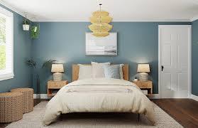
- Bedroom: Soft blues, lavenders, greens, and pale grays are excellent choices for promoting restful sleep. Avoid stimulating colors like bright reds or oranges.
- Bathroom: Light blues, greens, and whites create a spa-like atmosphere. Consider adding touches of natural wood for warmth.
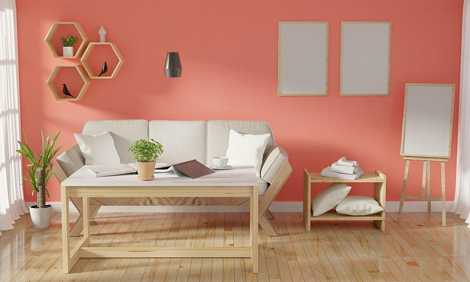
- Living Room: Neutrals like beige, gray, or cream provide a versatile foundation. Add pops of calming color through accessories like pillows, throws, and artwork.
- Home Office: Soft greens and blues can promote focus and creativity without being distracting.
- Kitchen: Softer shades of yellow and green can create a welcoming and calming environment.
Conclusion
Creating a relaxing home environment is an investment in your well-being. By understanding the psychology of color and carefully selecting soothing hues, you can transform your living spaces into tranquil retreats. Experiment with different combinations, consider the function of each room, and prioritize creating a space that feels peaceful and restorative to you. Embrace the power of color to design a home that nurtures your mind, body, and soul.
explore further
Latest from Contemporary ideas
More from Innovations
Resources


Dwello, for every home buyer, is a way to go from 'I feel' to 'I know', at no extra cost.